Product Design
Locale
Improving the co-living experience by connecting tenants, landlords and local businesses.
About the project
The challenge:
Co-living is a housing solution that has been gaining popularity in the last years around the world. The idea of living in comfortable place, while having access to tailored services and being part of a community is very attractive specially along students and young professionals. Usually this solutions are grant by different providers which force users to utilize diverse applications for each necessity.
As consequence, the interaction is very fragmented and the information remains descentralized, adding complexity to the user experience with the digital touch points.
The outcome:
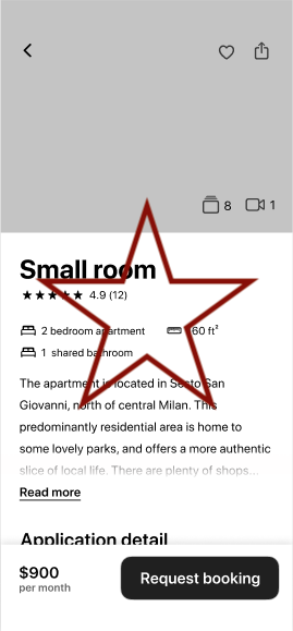
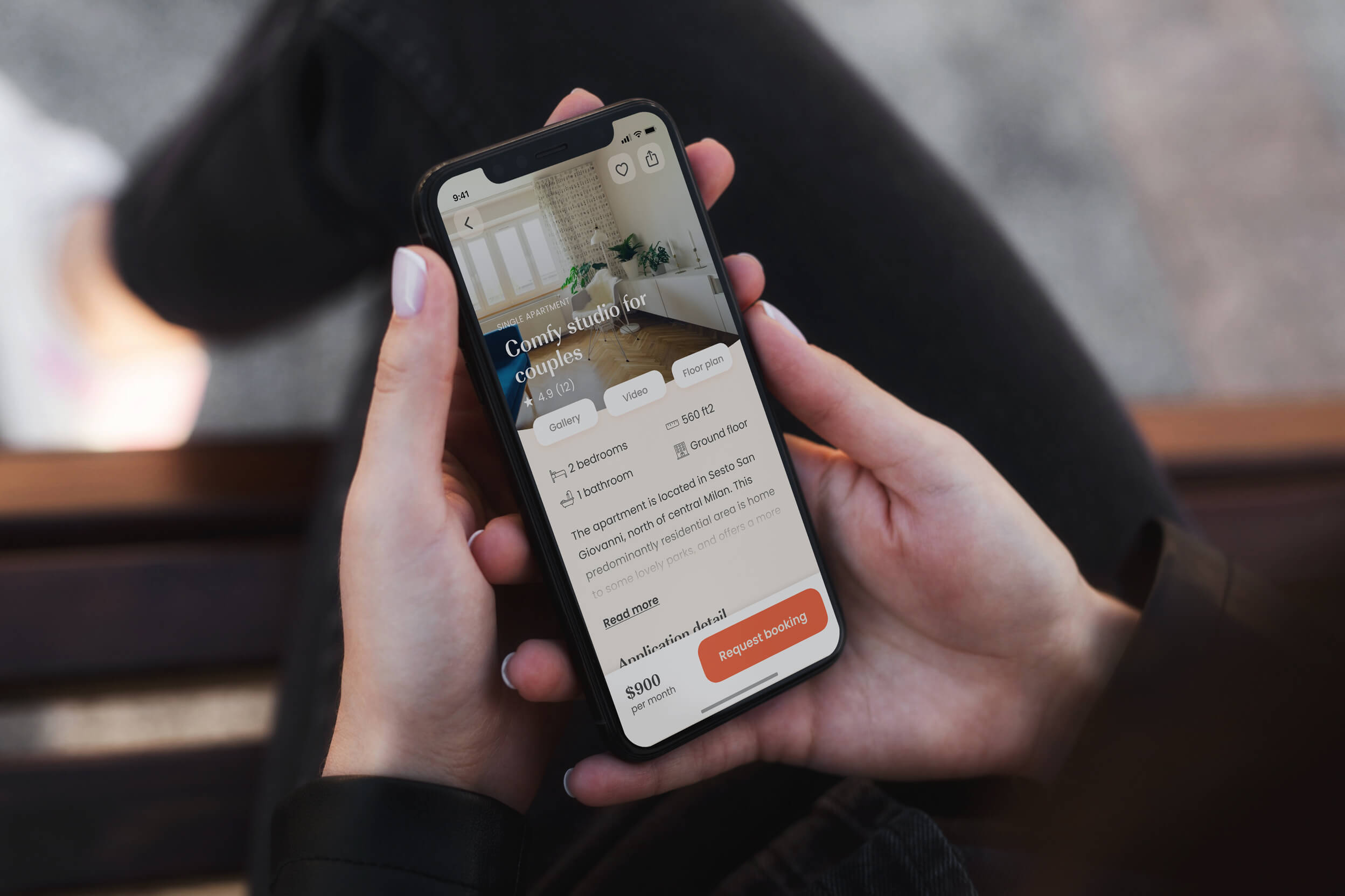
A partnered with Locale to design a native mobile application where tenants, landlords and service providers could connect and achieve their particular goals such as rent places, request services and have total control over payments.
Desktop Research
What are the currently options in the market?
In order to gain insights about the current digital solutions that are available around the market, a total of 15 platforms were qualitative analyzed in terms of user experience, structure, content and visual design. After this analysis it was possible to identify good practices, check some navigation patterns and foreseen possible opportunities for our product.
The main navigation patterns noticed during the benchmark analysis include the use of "One page, one action", providing the feel or personalized search results; OTP generator to avoid spam and fake accounts and Temporary data saving when completing a form that requires a huge amount of info.
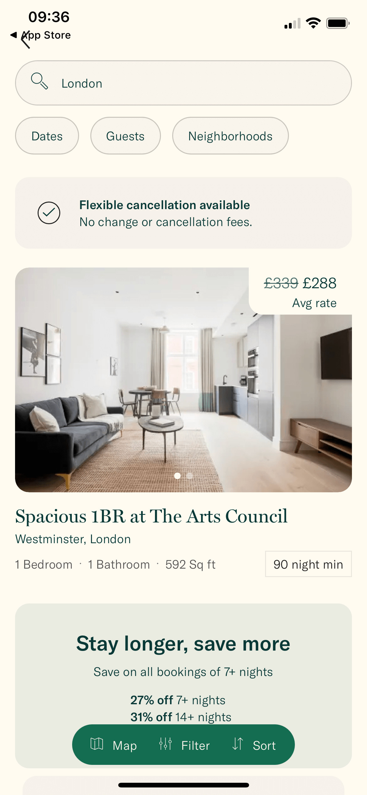
Sonder's home page.
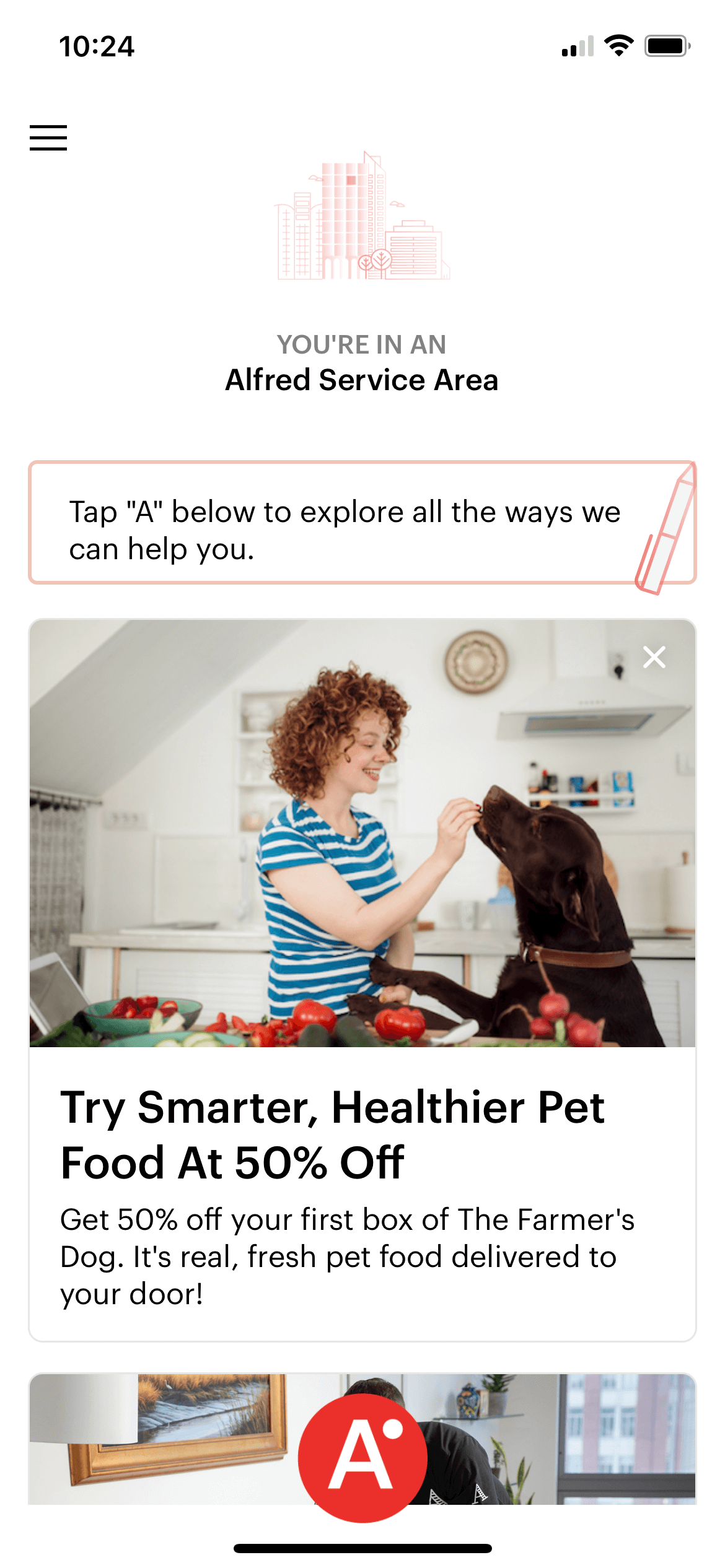
Hello Alfred's service area.
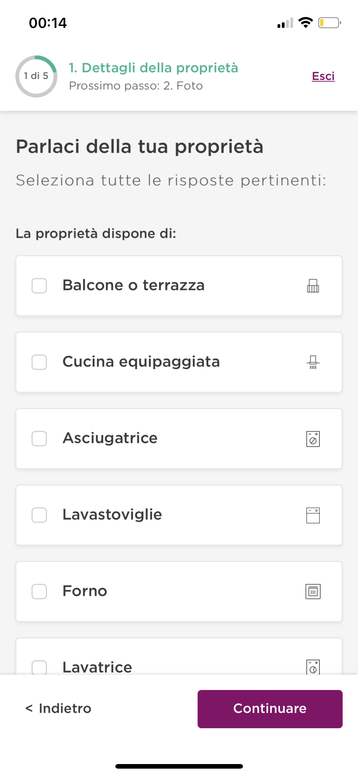
Spot-a-home listing form.
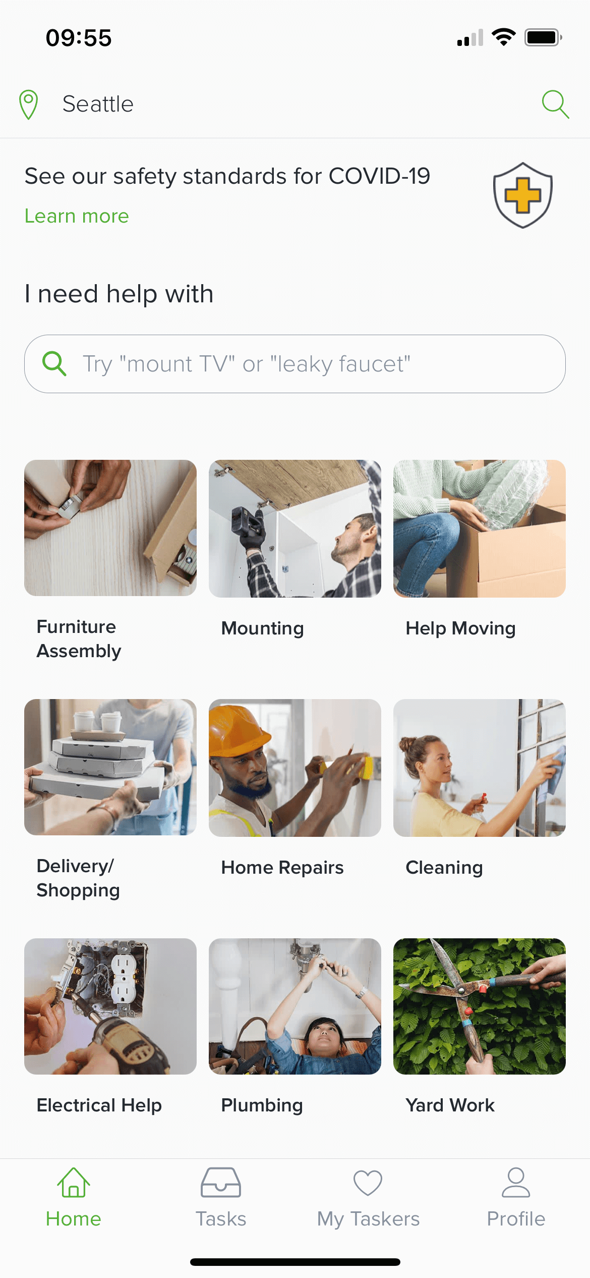
Task Rabbit's services screen.
User Research
Who is going to be using the app?
Since the app works as the main digital touchpoint for the different services that Locale provides, several User Personas were built to understand which were the specific needs and pain points to take into consideration. We gained some insights by asking real users about their journeys and consumption habits when booking places to live, listing properties to rent and offering concierge-like services.
This step was not only important for the conception of the app, but also it allowed to discover business oportunities for the company after considering new user needs that were not contemplated at the beginning of the project. For instance, aspects such as mobility and social interaction proposed new potential partnertships with transportation platforms and local restaurants.
Alice

Tenant, 25
"Hidden fees when looking for a place to rent is definitely a deal-breaker"
- Main needs:
- Finding and rent places that fits her budget.
- Meet new people in the area.
- Pain points:
- Lack of time to do chores.
- Social isolation.
Robert

Landlord, 37
"It's really stressful and exhausting to ask tenants' for overdue rent payment"
- Main needs:
- Publish his place to get tenants quickly.
- Control over payments.
- Pain points:
- Overdue rent payments.
- Inadequate tenants profile.
Jason

Partner, 37
"I'd love to increase my client base but I don’t trust so much in these apps."
- Main needs:
- Reach more potential clients.
- Multiply the word-of-mouth of his services.
- Pain points:
- Unestable schedule and services requests.
- Not sure about digital channels.
Ideation
How will the app adapt to the users' journey?
The information and options displayed in the app should correspond to the needs and goals that the user might have in a particular point of the journey. For that reason, it was vital to realize how the app will react to this changes in an organic way so the interaction can keep running smoothly in every case of use.
Tenant's journey
Renting a place
In order to show the best-fitting results to users when looking for a place to stay, a guided form was structured with simple questions about their housing needs and expectations.
Landlord's journey
Taking new tenants
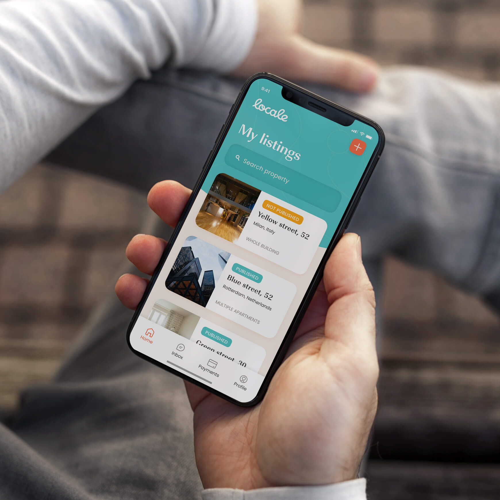
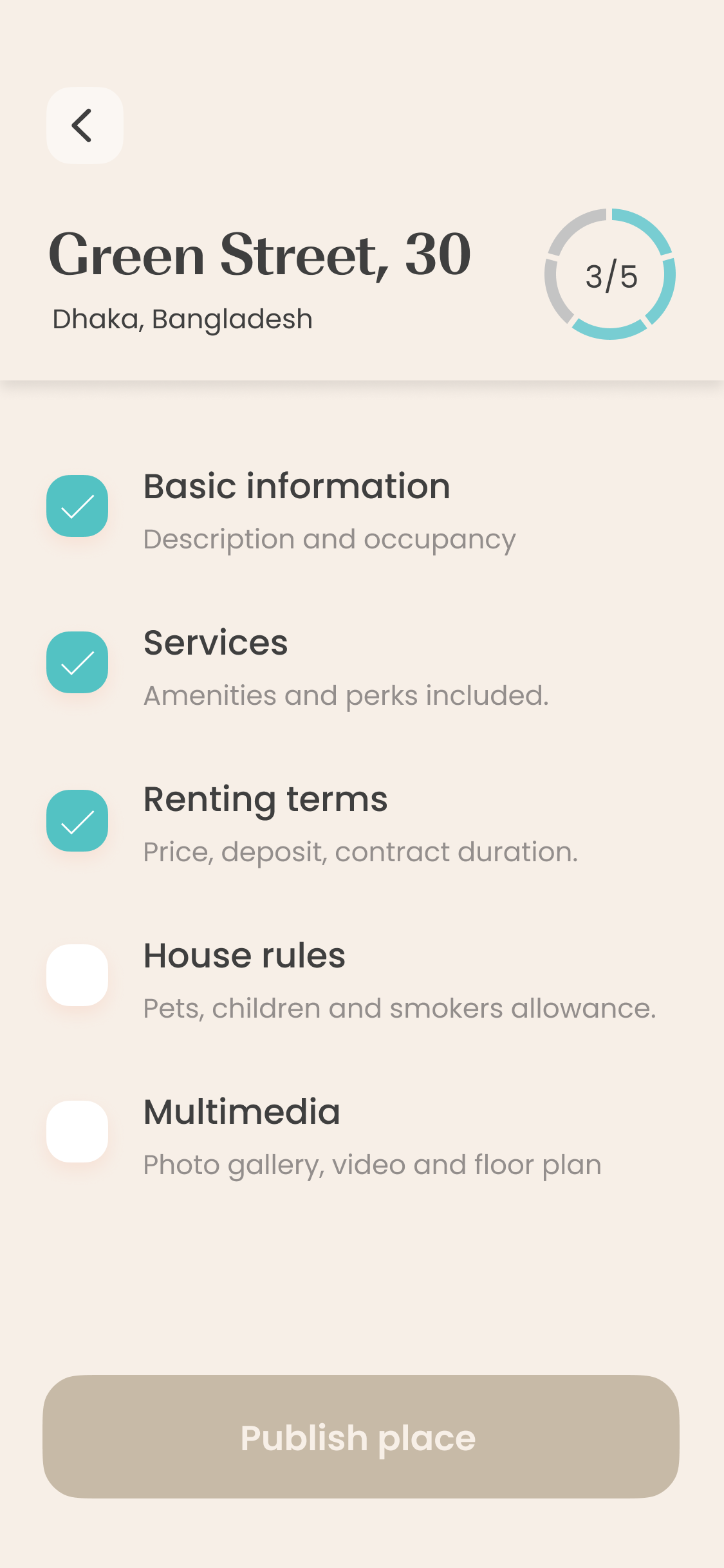
The listing process was broken down into different steps due to the large amount of information that the platform requires. This way the user can partialy save the progress and continue later from that point.
Partner's journey
Carrying out services
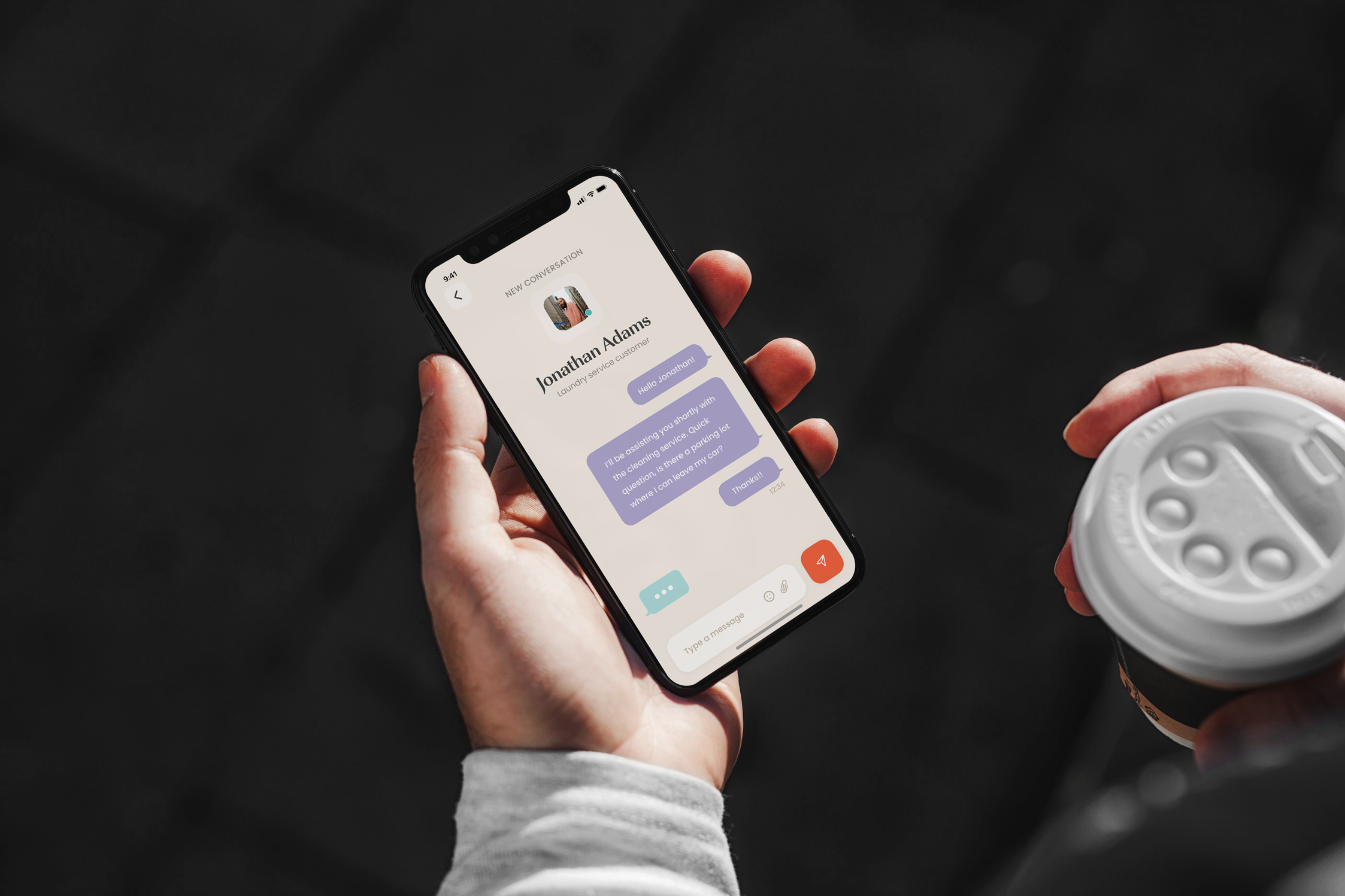
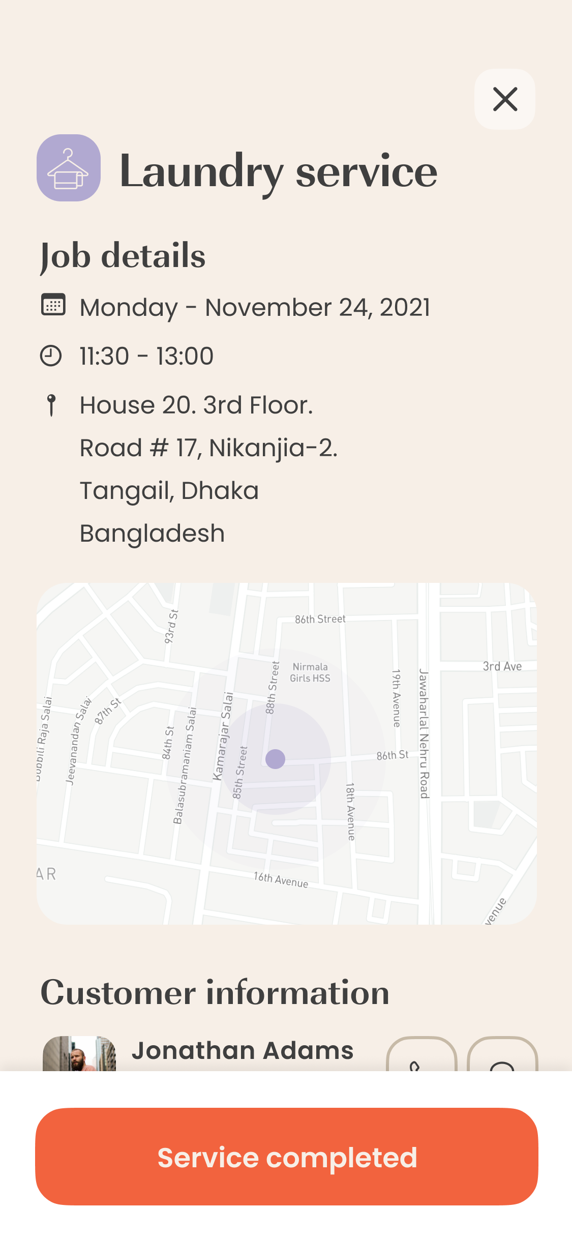
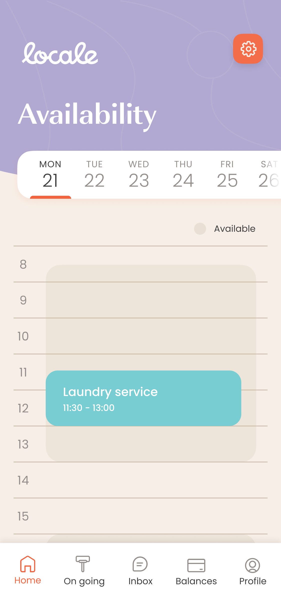
In order to receive accurate service requests, the business have the option to set their opening and closing time in the app. This way, only requests that matches with that schedule will be assigned.
Visual design
Communicating the brand values through UI elements.
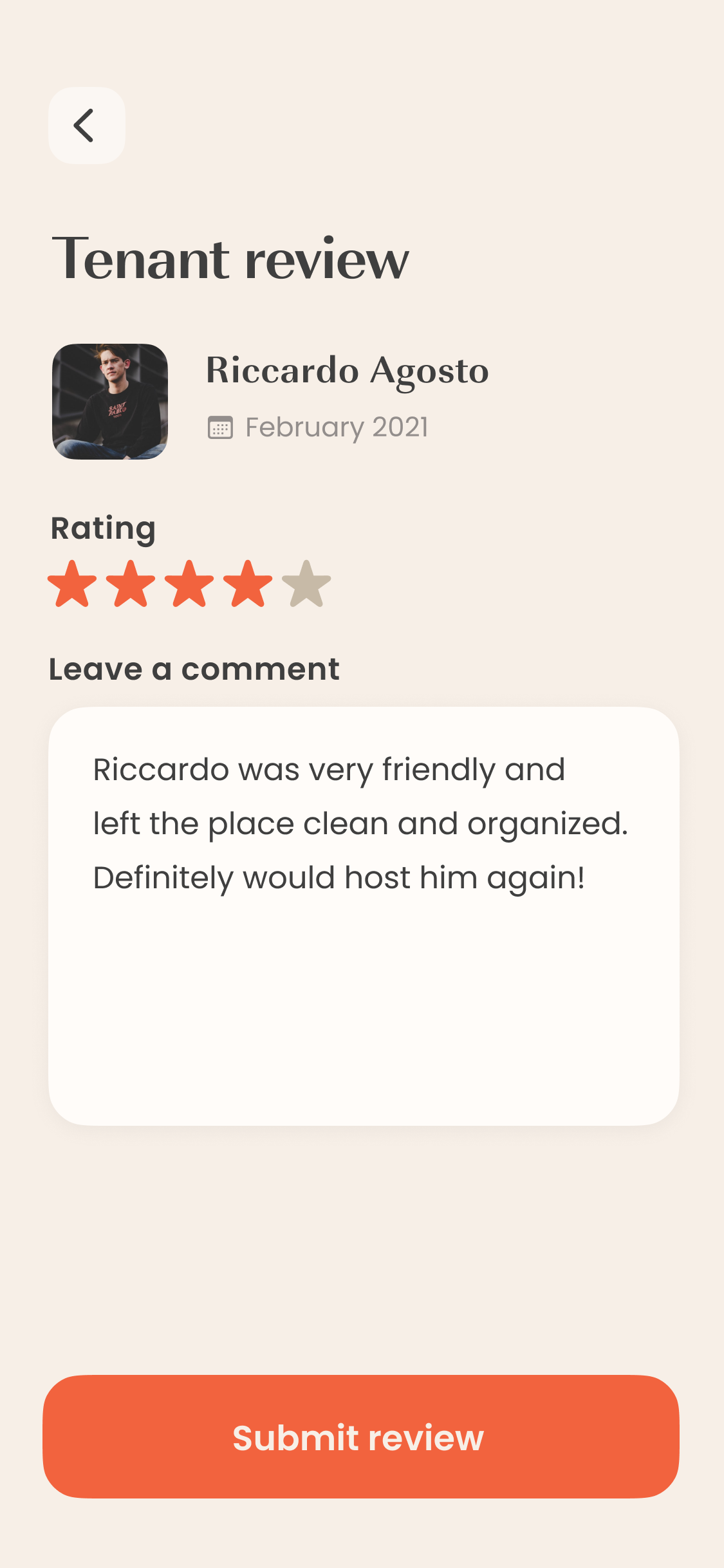
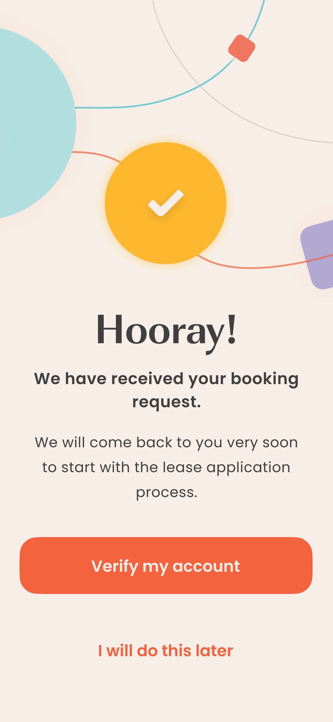
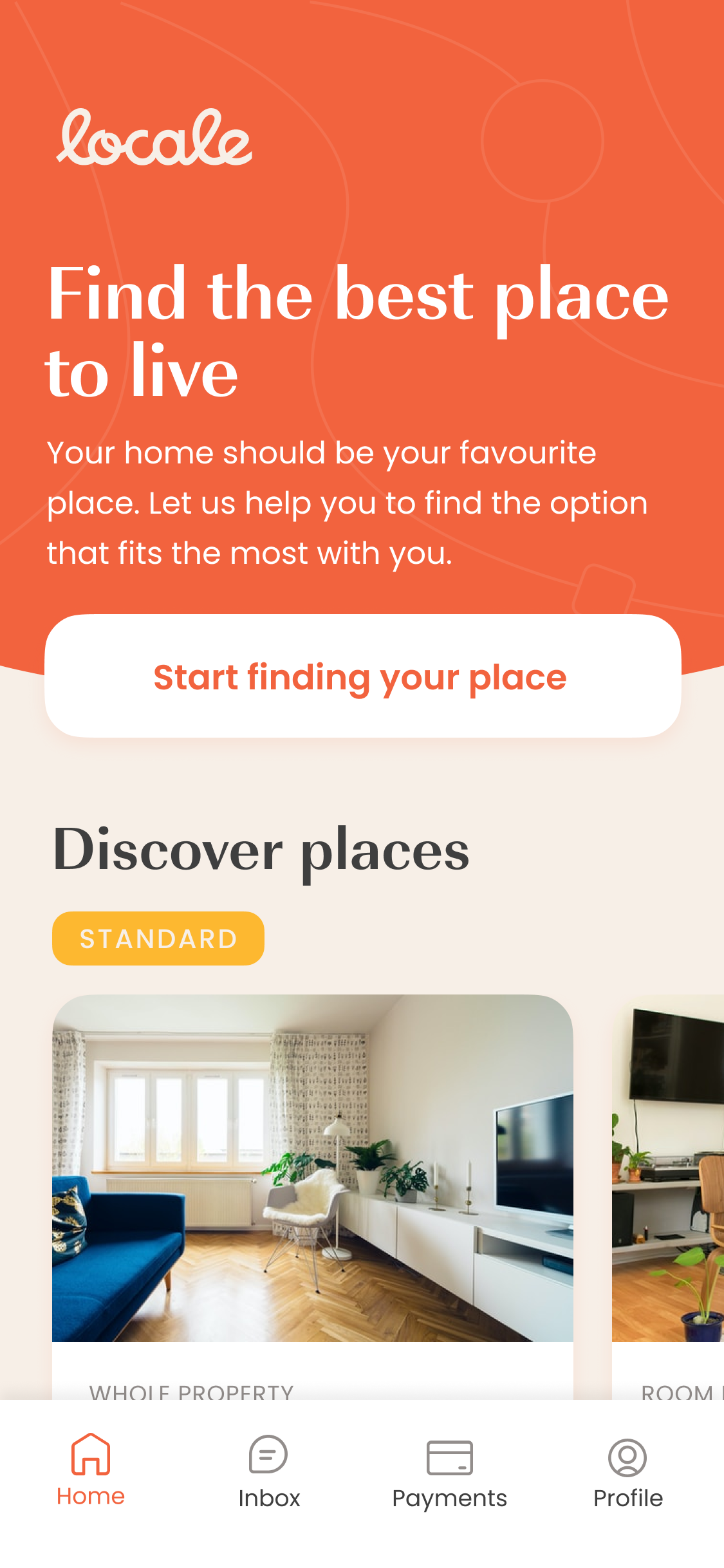
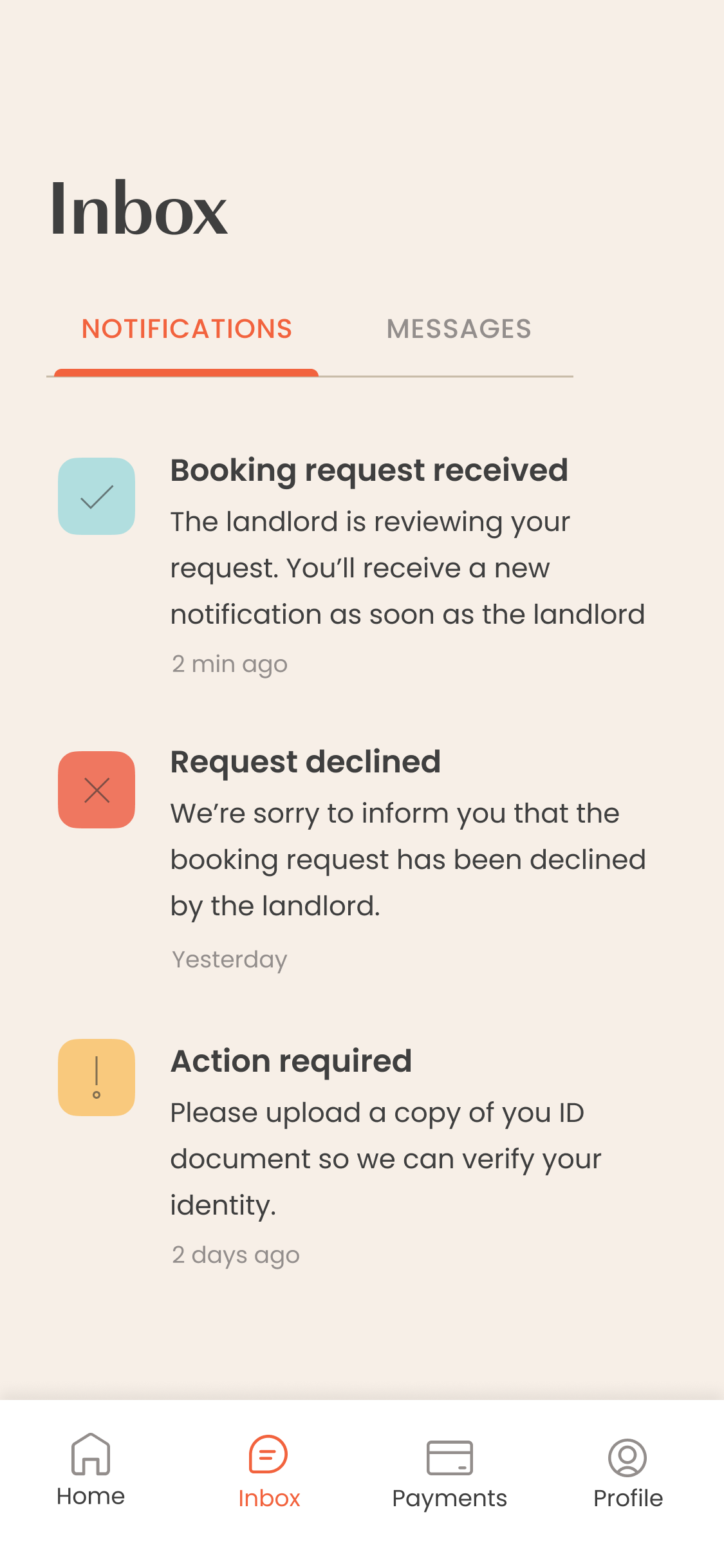
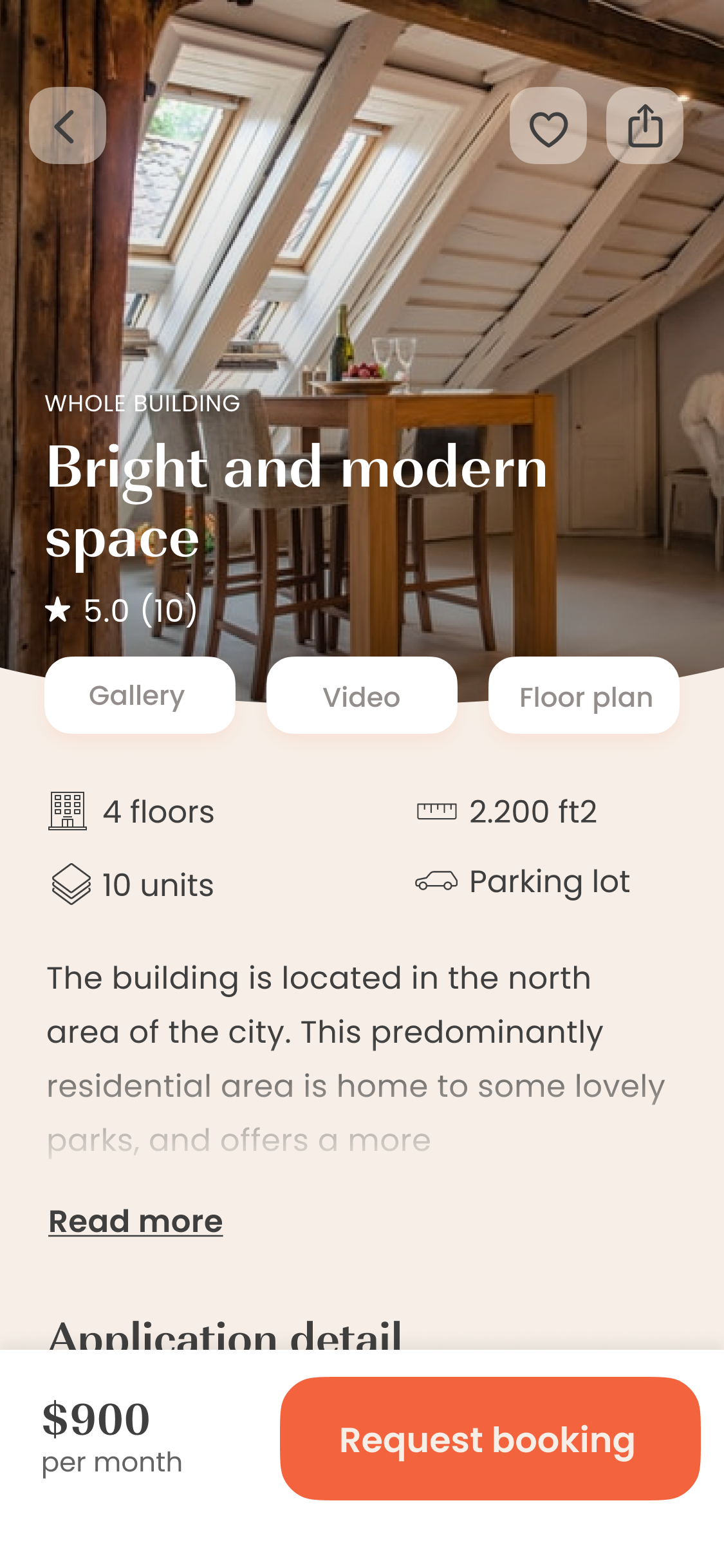
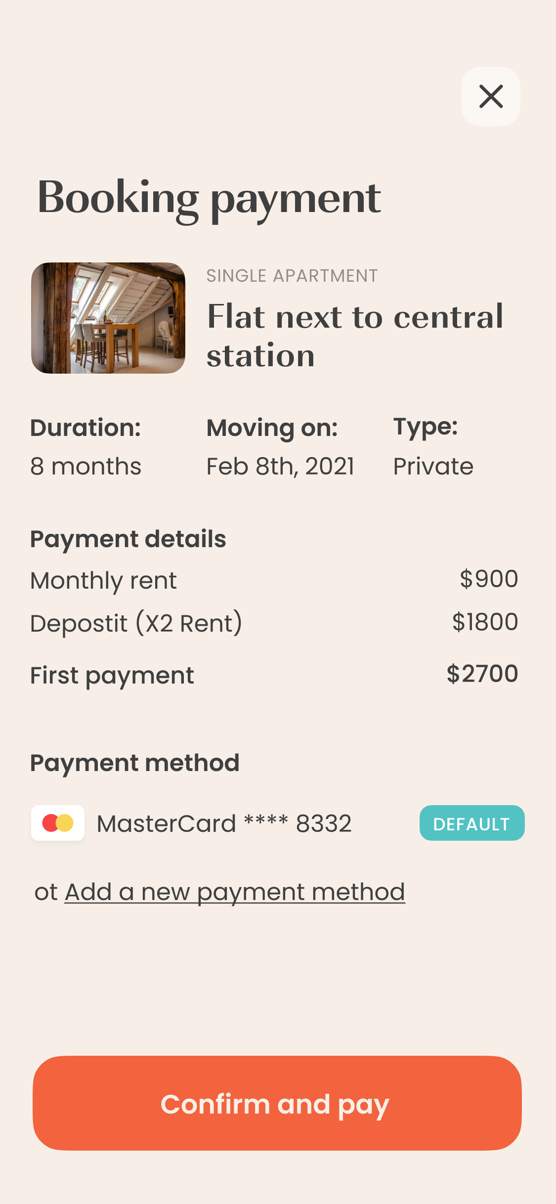
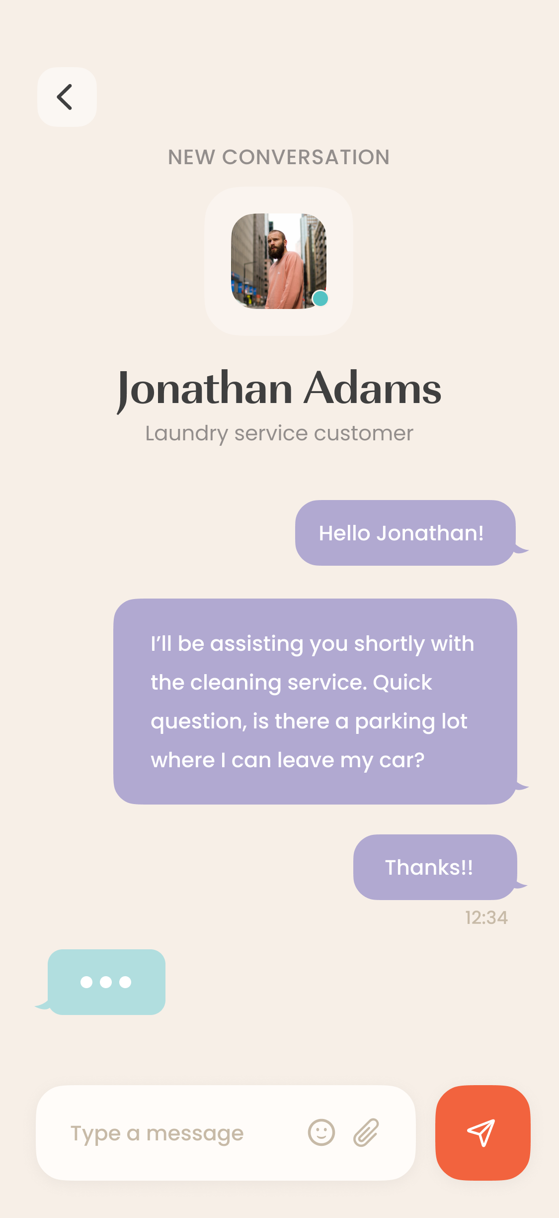
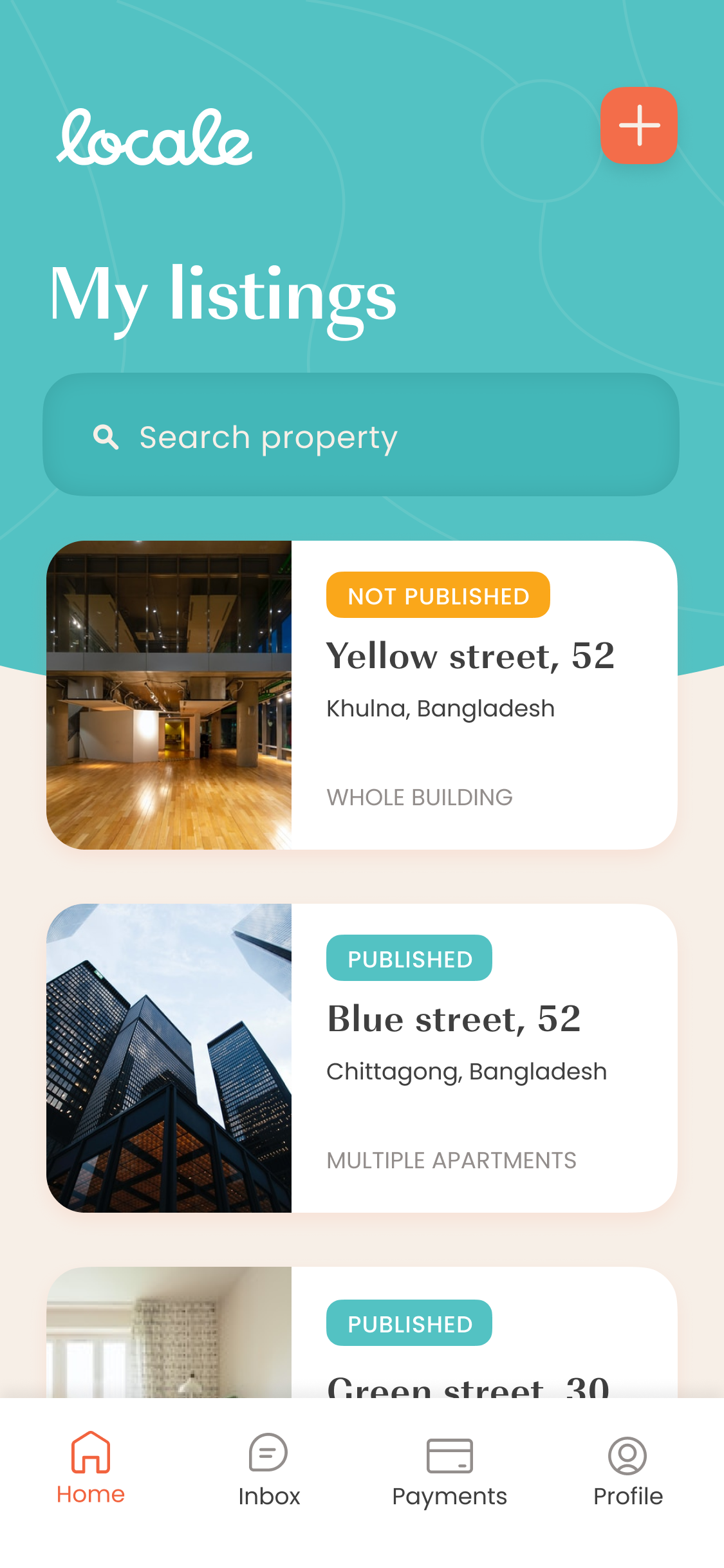
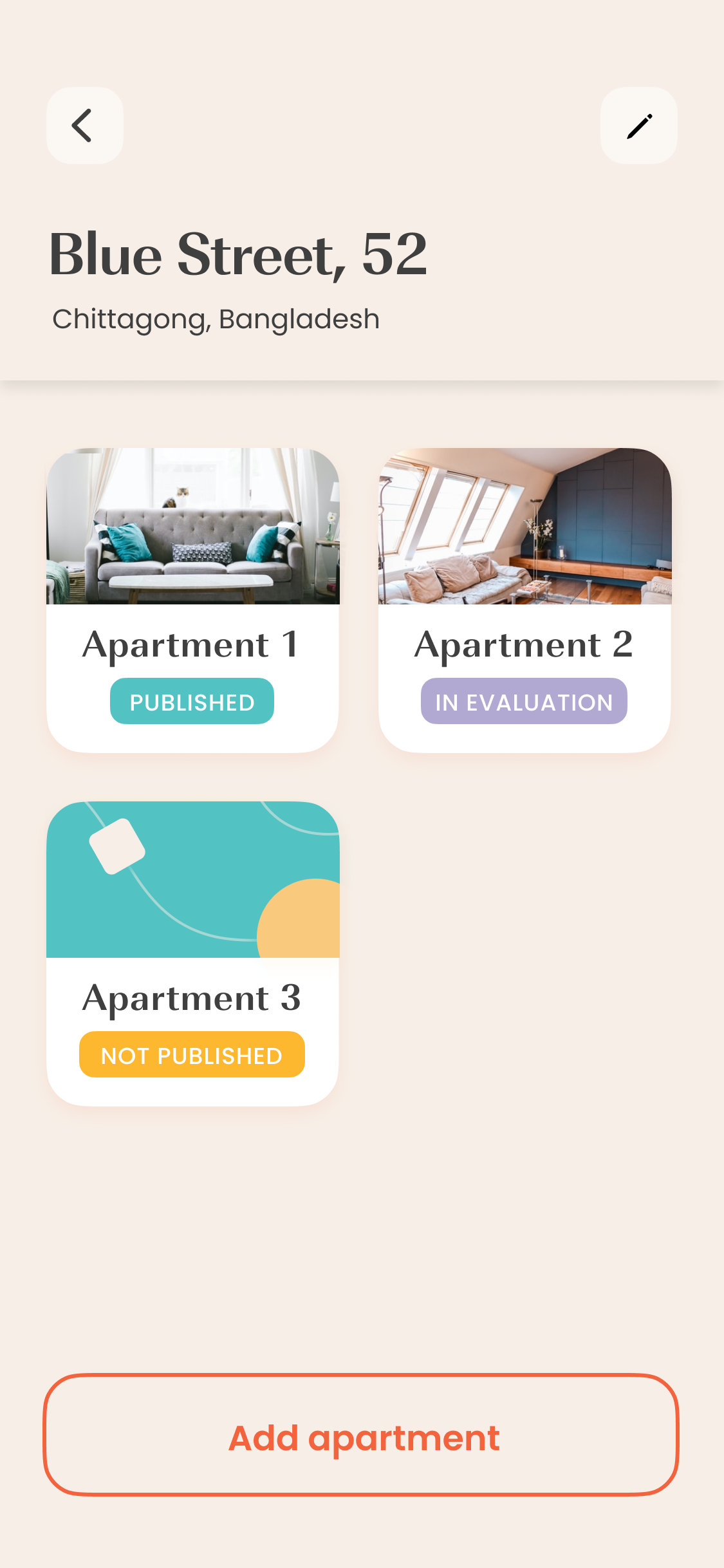
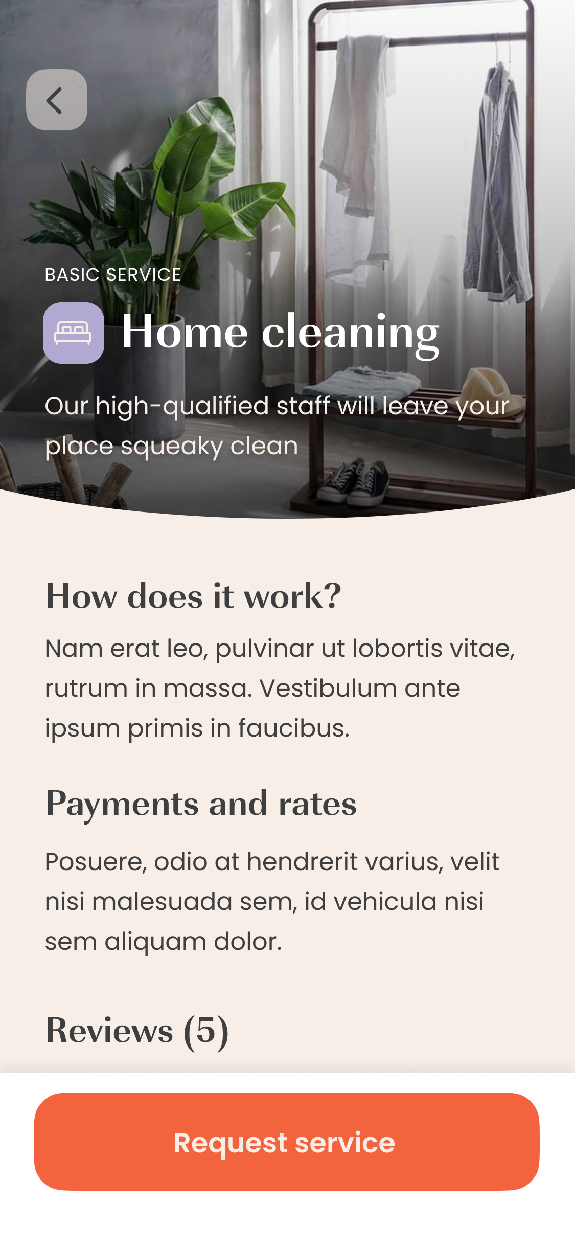
Reviewing Locale’s brandbook was the first step when starting the visual design phase of the project. The goal was to convey and highlight the same concepts that the brand wanted to communicate into the User Interface design. In this particular case, presenting the app as Friendly, Fun and Trendy became possible through visual design decisions like the display of big, bright color panels with geometrical patterns, and rounded corners in different elements such buttons and cards.
Main color palette
The typography pairing was adapted from the brandbook, providing wide range of possibilities to give hierarchy to the content by scale and font variation. Regarding the color palette the challenge was first, to pick the right tones from a large selection on the brandbook, and then assigning this colors to the different elements and roles so they respond logically to the navigation flow.
Example of buttons variations
After establishing a solid look and feel, a visual design system with the whole UI elements -and their variations- was designed so the coherence of the interfaces can be easily managed anytime that the product scales up. This was also very helpful for the dev team, because the characteristics of the components will be maintained once they are created, avoiding for them to re-do unnecessary tasks.
Data administration
How to manage the information submitted by users?
When building an user-centered product it’s very important to consider both external and internal users. In this case, a web-based admin panel was created in order to help the personal from Locale to consult and administrate the information inside the app’s database, perform verifications and generate reports. This phase of the project was co-designed with Locale’s employees to include all the possible use cases during their job tasks and also to assure that the information structure corresponds to the needs they might have.
A requirements list was created based on the insights from the Locale's team about the current activities that they perform regarding the administration of the information that external users will be constantly submitting. With this in mind, the sections of the panel were defined in correspondence with two aspects. First, the the information categories that will be consulted by the user such as Users, properties, trasactions and the actions that the user will perform over that information E.g. find, filter, consult, verify, activate, contact.
This step of the project was a very interesting co-design exercise accomplished with the collaboration of Locale's internal team. Having access to constant feedback was a very helpful fact that allowed quickly iterations and prompt design of the modules.
Lessons learnt
- Breakdown complex projects in manageable phases, but don't miss the global scope.When there is a large amount of variables in the project it's necessary to tackle them in different moments. Just be sure that this phases engage smoothly with each other.
- Be wide open to critic and feedback. It's very important to consider every comment, idea or critic because this will force you to costantly justify your design decisions, increasing the odds for a more successful product.
- Think beyond the happy path. Take into consideration use cases where the interaction might be interrupted so you can work on the solutions for this issues.
🙌 Special thanks to: Rayana Hossain(Dekko Gruop CEO) and Sharif Mustaf(Product Manager).
