Product + Web Design
Isho Studio
Driving the interior design process towards digital channels and remote communication tools.
About the project
The challenge:
As consequence of the lockdown measurements that have been adopted around the globe since fall 2019 because of the Coronavirus pandemic, businesses have explored and adopted new ways to communicate with their current and potential clients. In the case of interior design companies, the challenge is even more interesting because it’s usually a process where the presence on-site it’s expected.
Shifting the traditional physical experience towards digital channels is a process that requires a lot of attention specially when small details in the information can change completely the understanding of a project.
The outcome:
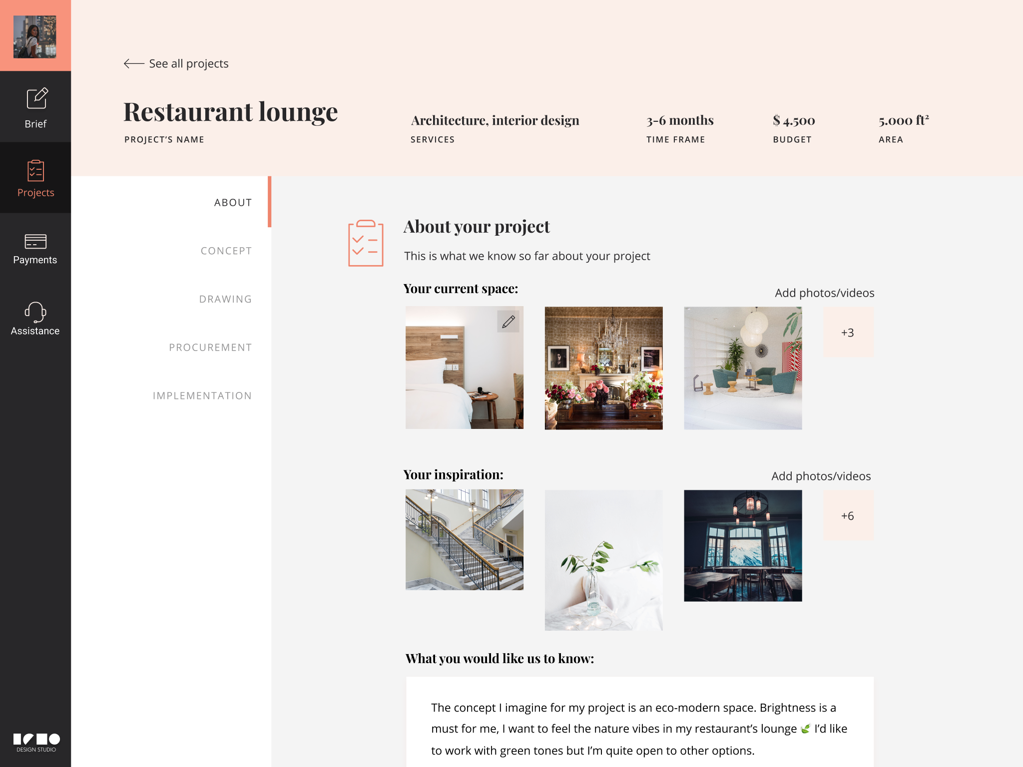
I partnered with Isho to re-design a web application where interior designers could connect with clients, interchange requests, ideas and feedback over proposals and easily manage all the information associated with the planning of interior design and remodeling projects prior their implementation.
Heuristic evaluation
Starting with an usability diagnostic
Redesigning a product usually requires an early examination of its current state in order to discover prominent flaws that might affect negatively the interaction with the user. During some cognitive walkthroughs, a heuristic evaluation was carried out based on the Nielsen’s 10 general principles for interaction design, evidencing high priority issues that needed to be fixed.
Sneak peek of previous Isho studio.
The main three aspects that required more attention were:
- Visibility of system status: The platform wasn’t displaying proper feedback about what’s happening and with processes are running.
- Match between system and real world The structure of the platform was not linked with the real life experience, making it more difficult to understand to the user.
- Aesthetic and minimalist design There was not visual hierarchy in the elements nor clear interactions patters given by user interfaces elements.
User research
What are the user's goals that the system should consider?
One of the main goals of the project was to establish a new communication channel between interior designers and potential clients, making fundamental to identify both roles’ goals, needs and paint points through user research. This step revealed improvement opportunities for the new version of the application, and at the same time it drew the path towards a better information structure.
Interior designer

- Receive leads from prospect clients.
- Interchange information with clients about projects.
- Access to content related with a particular project.
- Management system for interior designers when working with multiple clients.
Client

- Get guidance and inspiration for remodeling projects.
- Obtain project proposals based on delivered briefs.
- Request personalized assistance.
- Check on the project progress and schedule.
Ideation
Defining the main layout's structure
The insights from the user research and the heuristic evaluation constituted a strong foundation for the definition of the information architecture and its display on the application’s layout. The main objective of this step was to establish coherent navigation patterns across the interfaces system, responding to the user’s needs while breaking down the content in a meaningful and logic form.
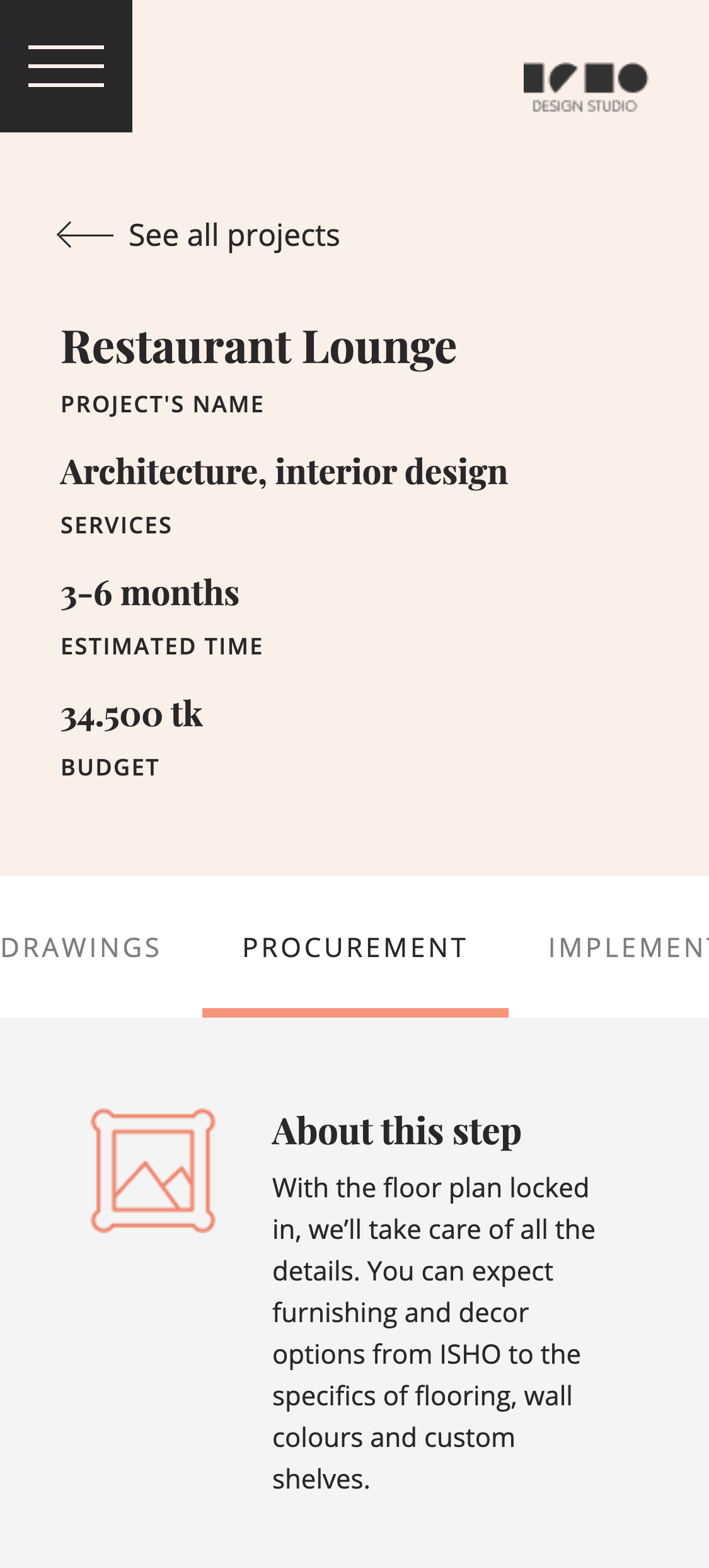
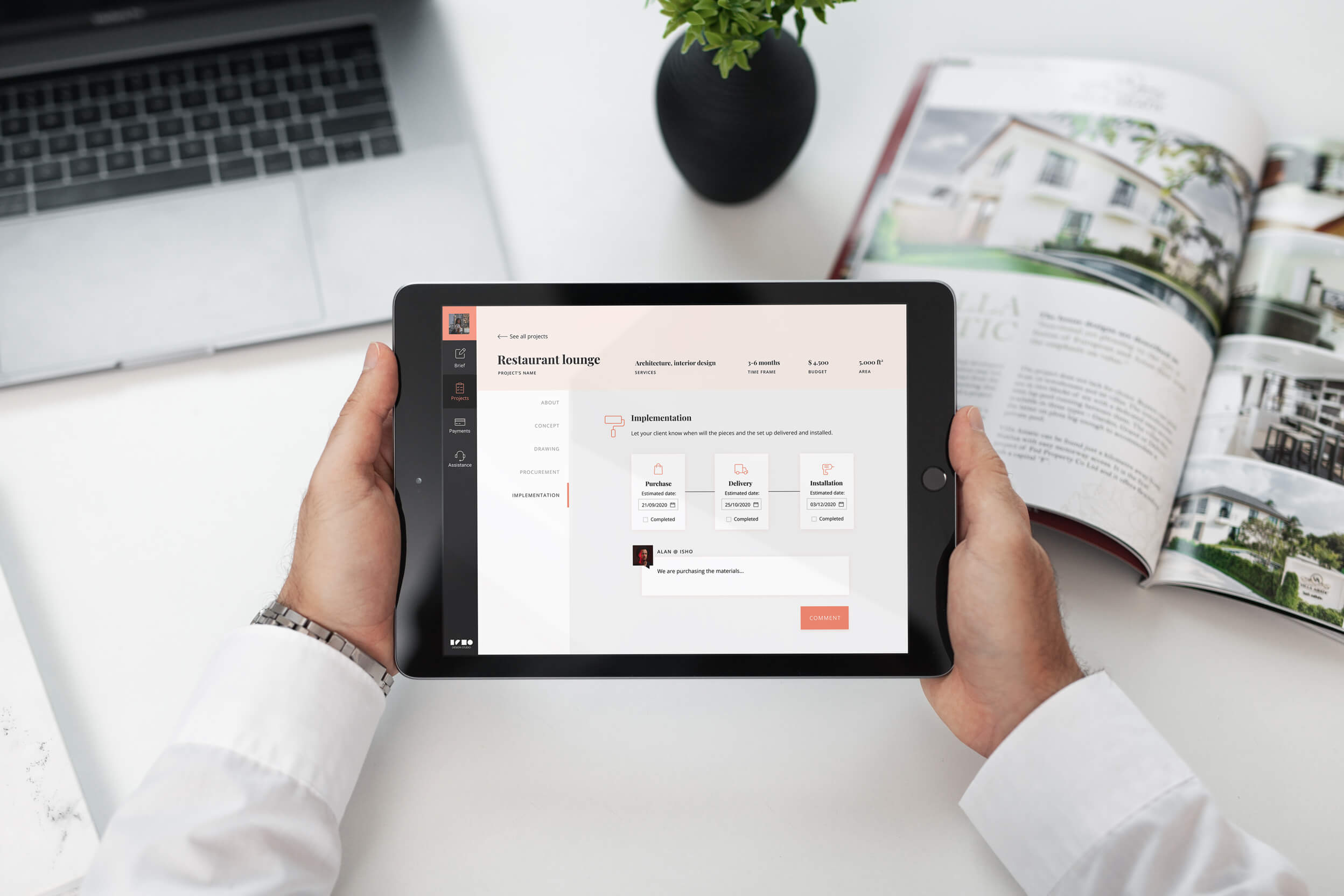
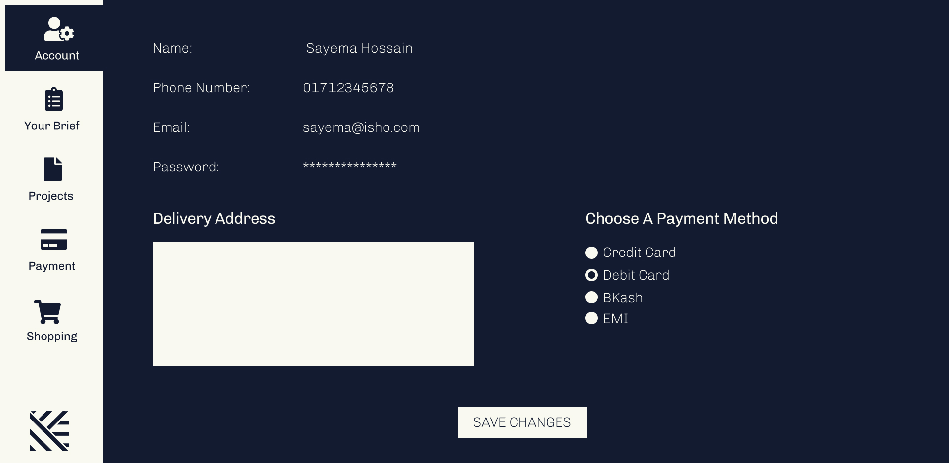
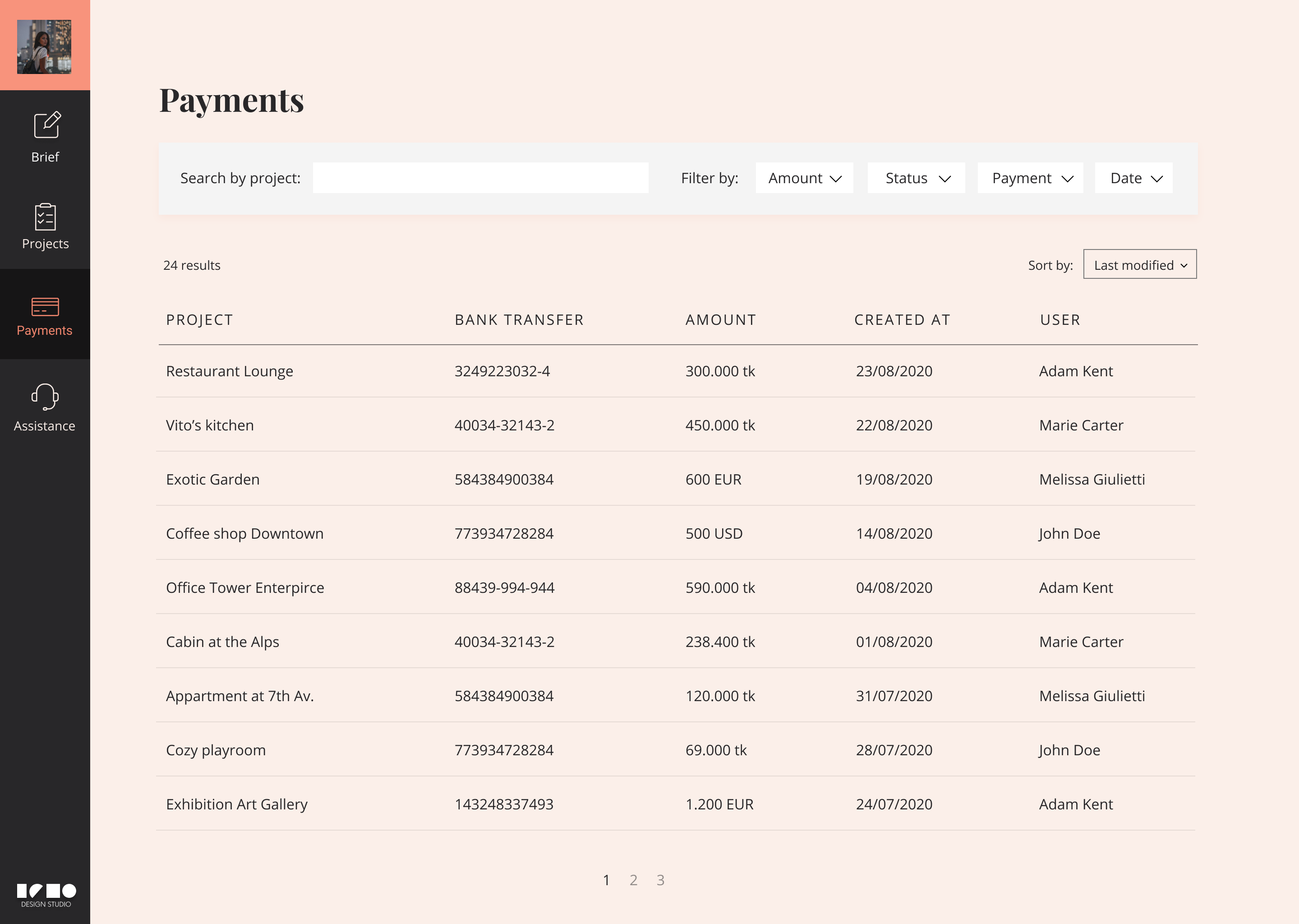
The navigation items were divided in two groups according to the hierarchy they own inside the experience with the application. The main navigation includes the top level information such as projects and payments, while the secondary navigation groups the information related with a specific project. Since Isho Studio is a fully responsive web application, a considerable amount of effort was used to define the behaviour of the modules in different screen resolutions.
- Laptop
- Tablet
- Phone
How might we ensure fluid communication between users?
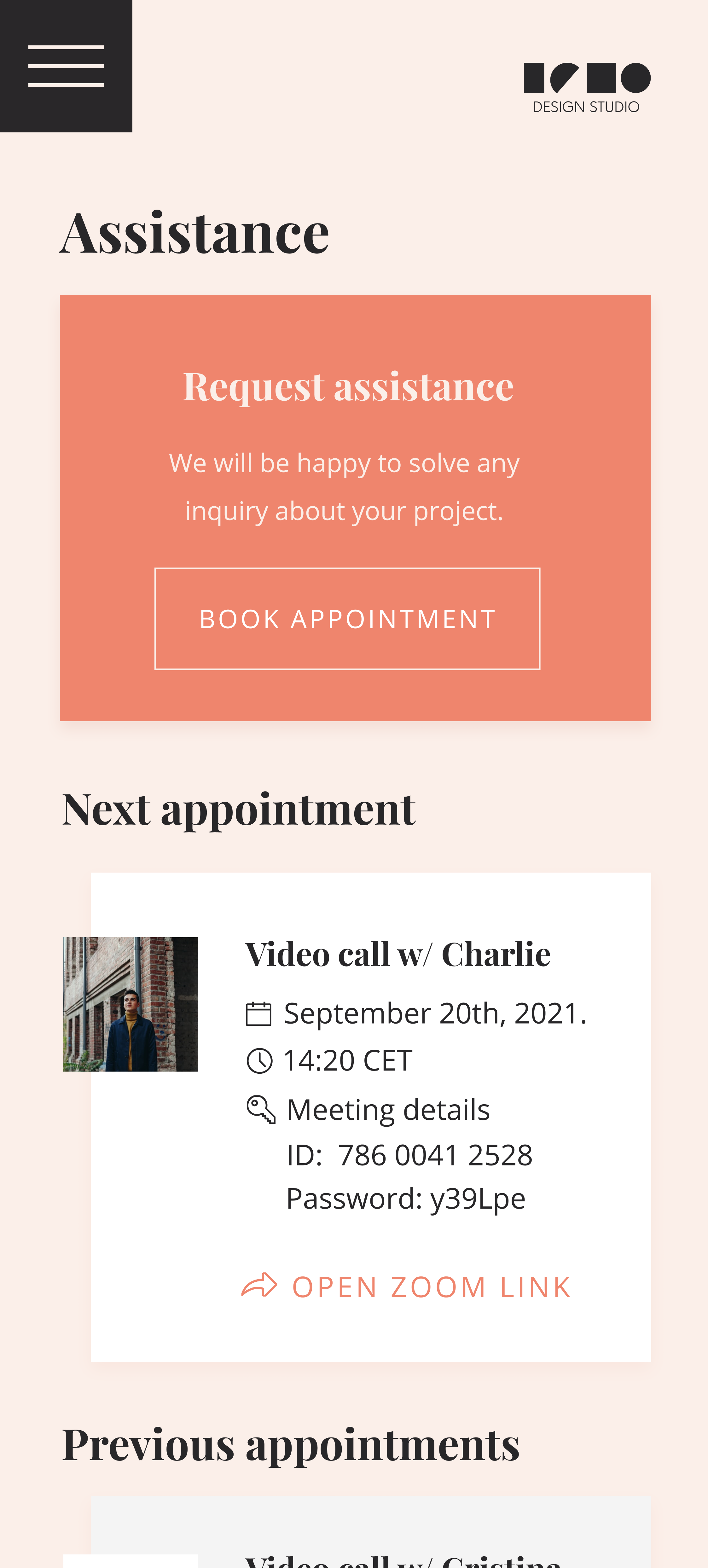
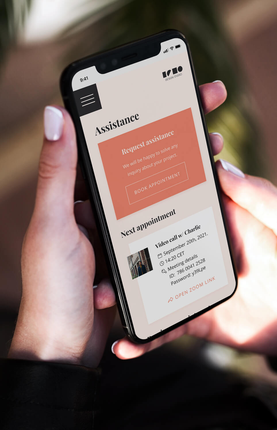
Shaping technology in order to create human connections is one of the essencial purposes when designing interactions. Since the moment the users get in touch using the platform, it's practical to build the communication flow based on the physical experience and translate it into a digital context. For that reason, the experience with the application was divided in three parts, where clients can first request a service, then take control of the projects progress and also ask for personalized assistance via video call.
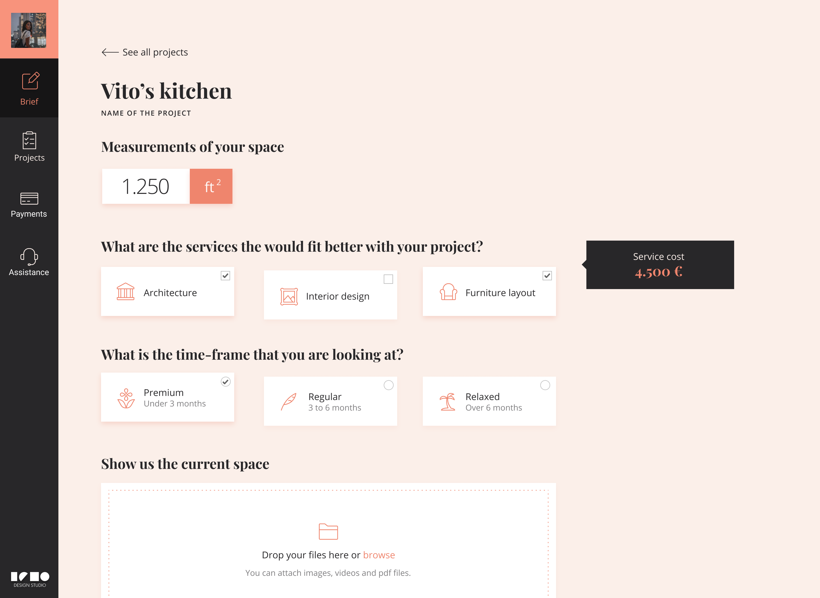
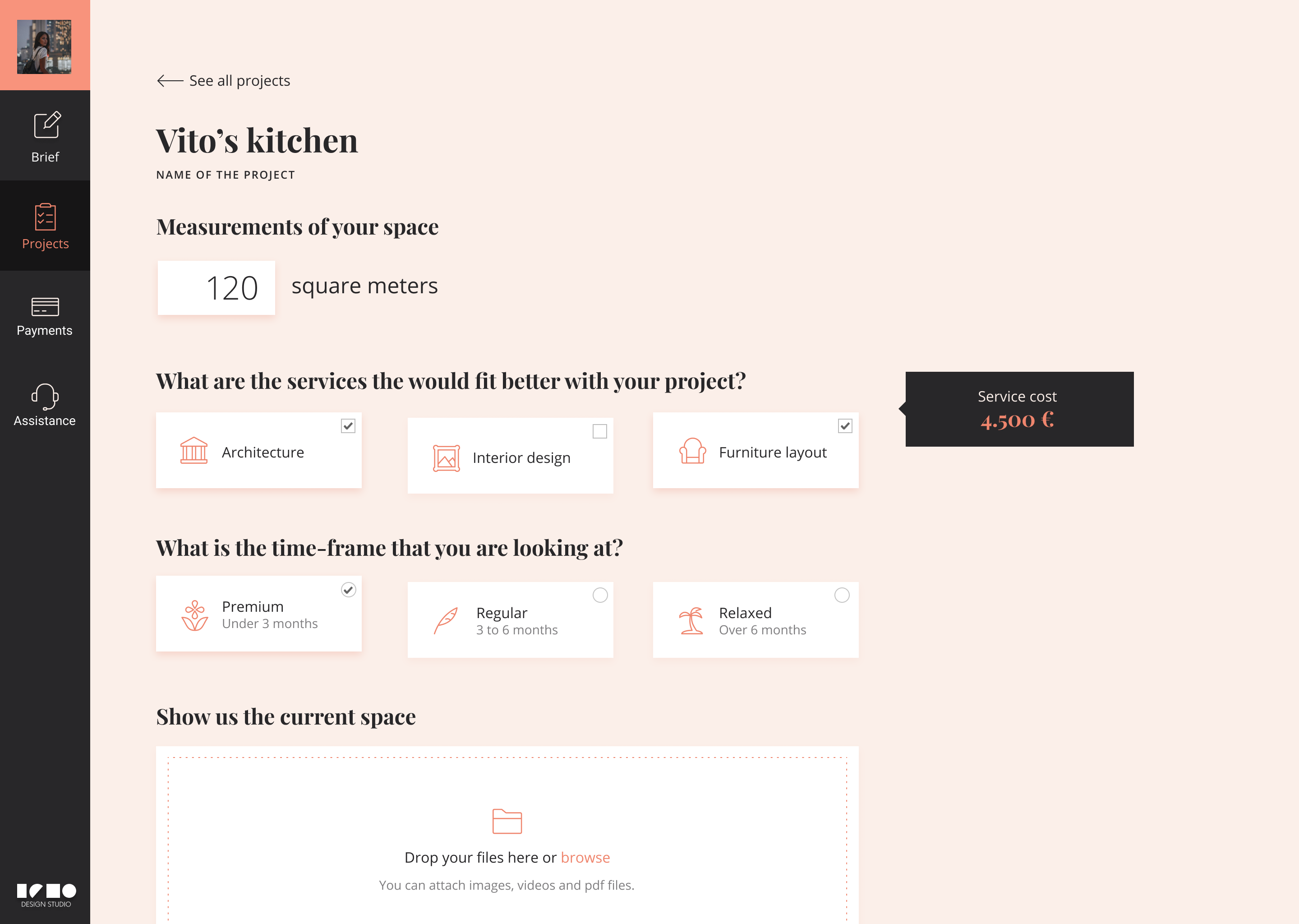
Brief submission
The potential client is able to send a brief with the interior design, remodeling or furniture counseling needs in order to receive a preliminar estimation of the project and its base price.
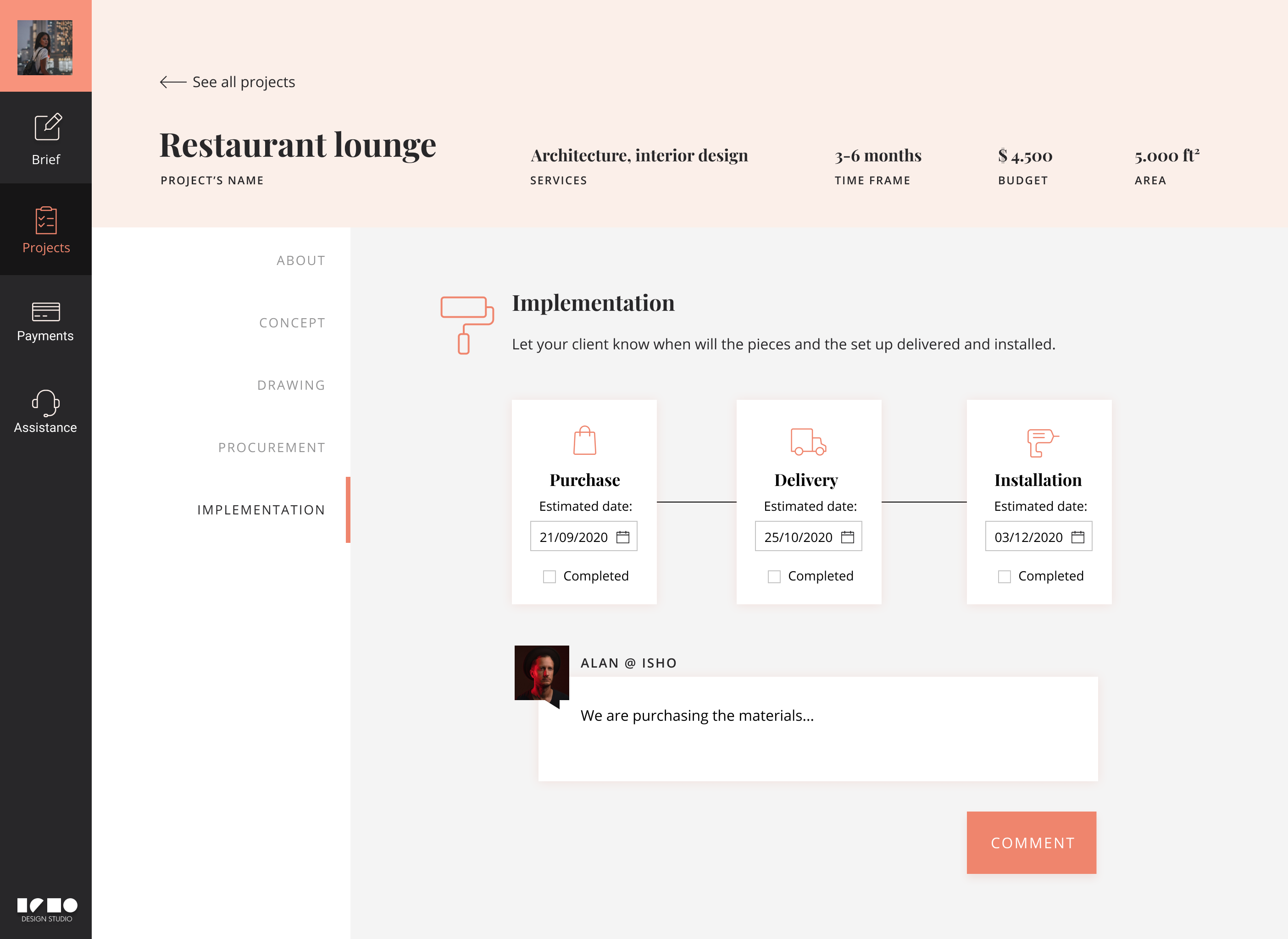
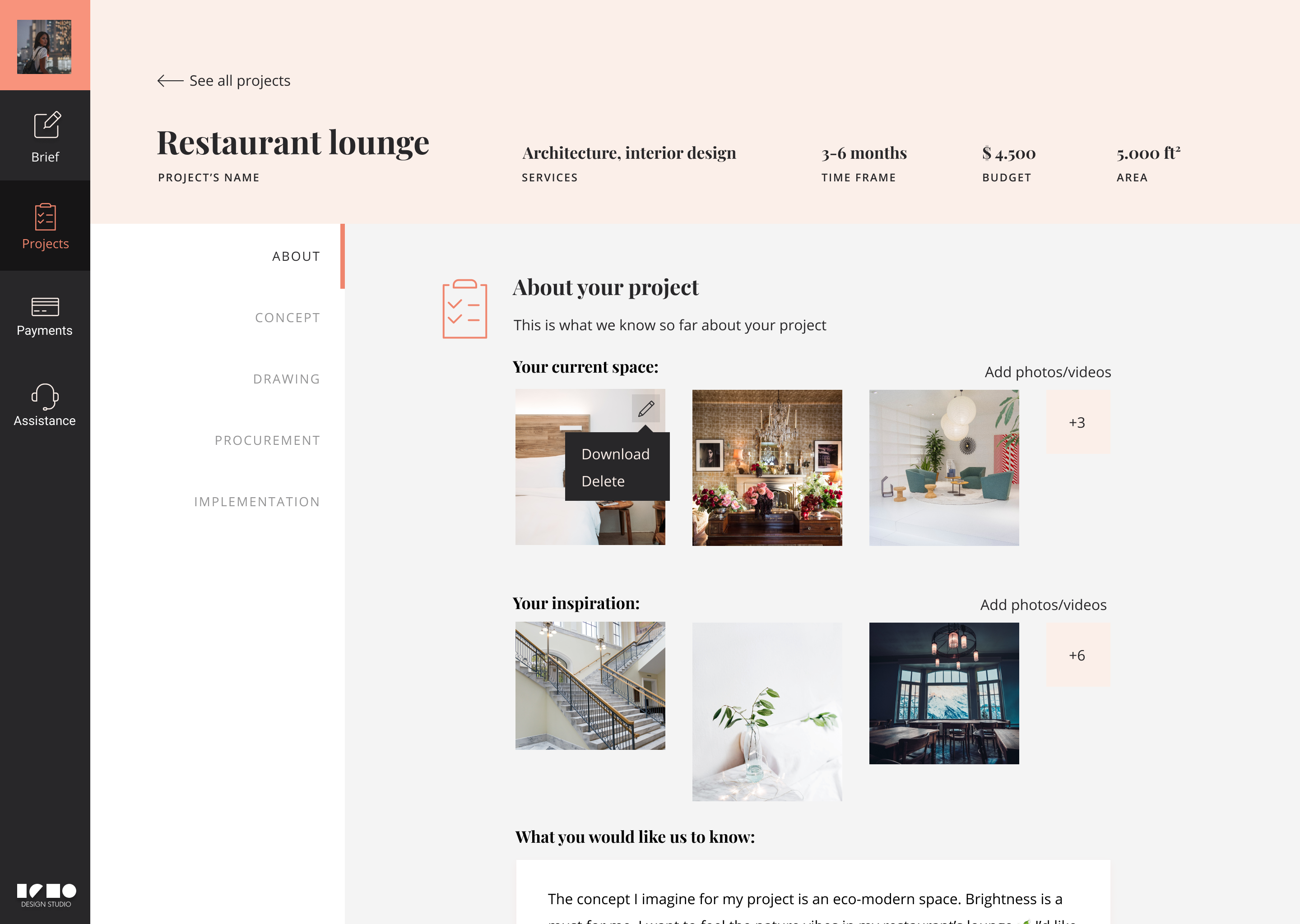
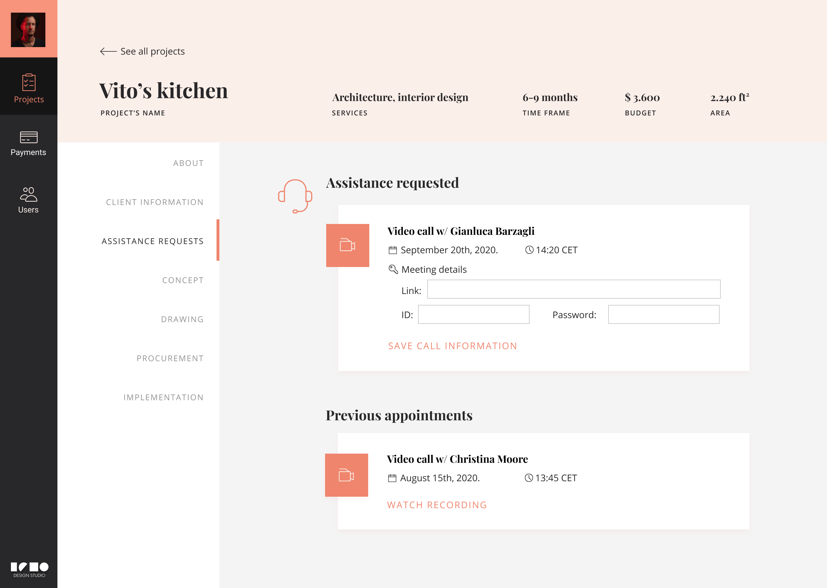
Project's progress
Once the project begins the client and the designer that takes care of the project can communicate through the platform so every specification is precise and stored for further revision.
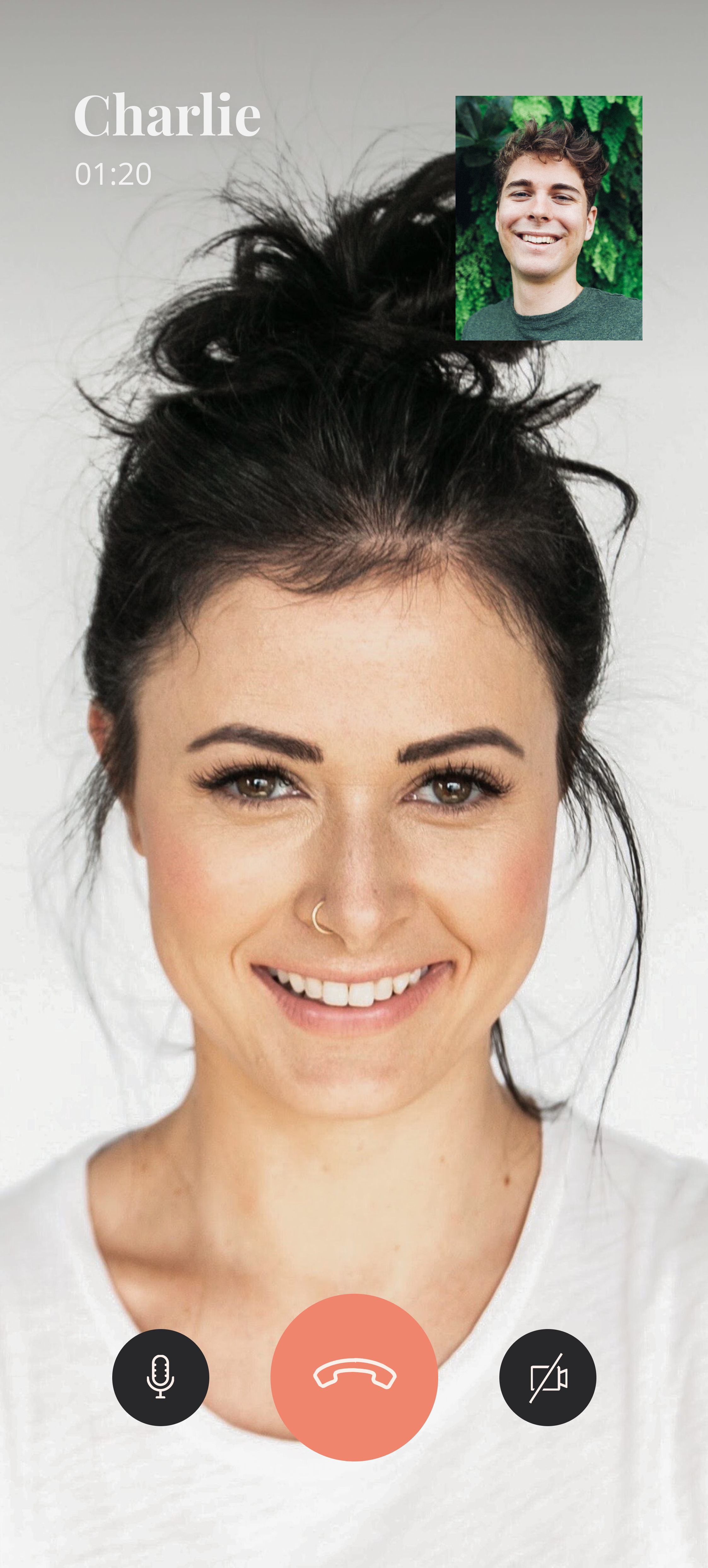
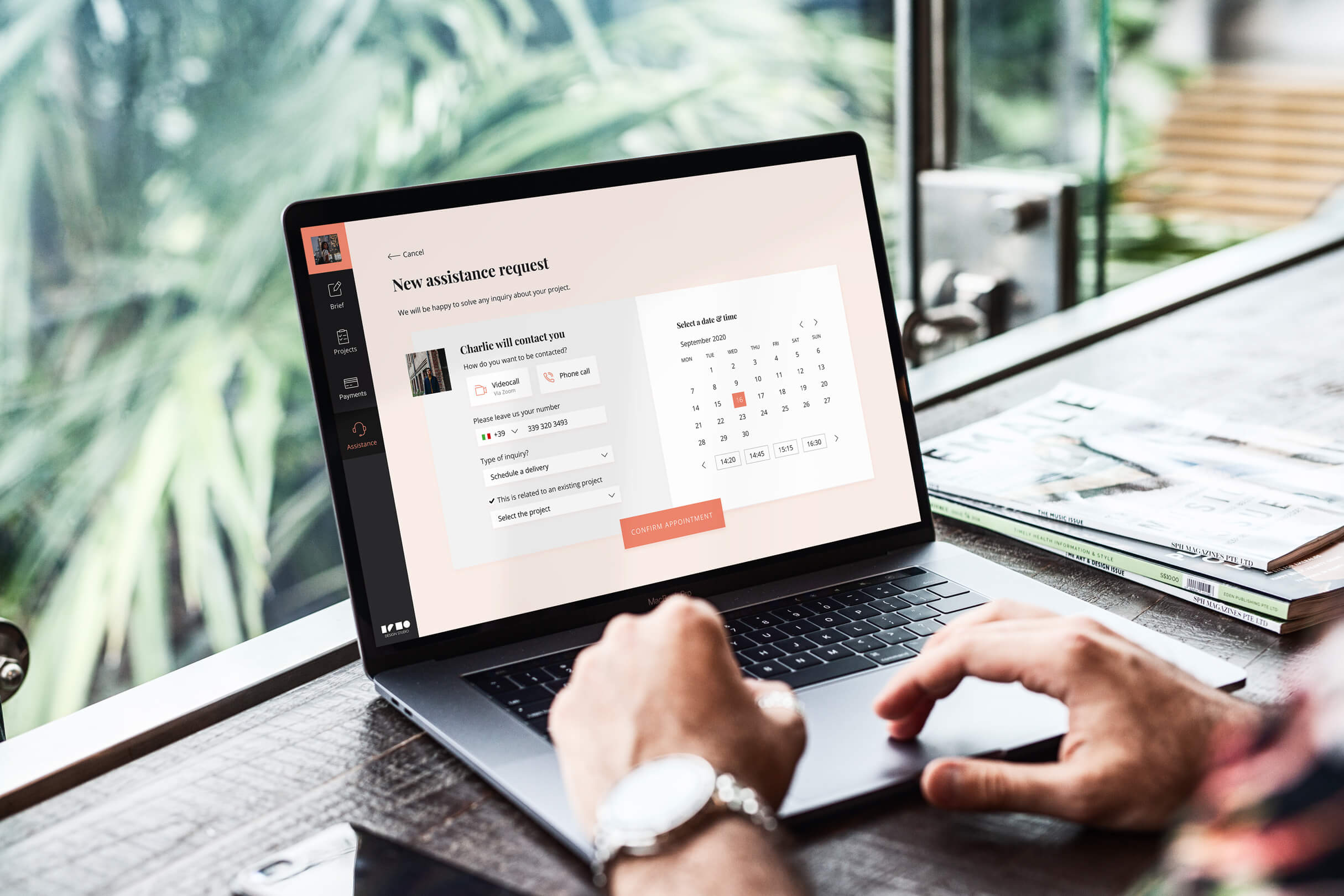
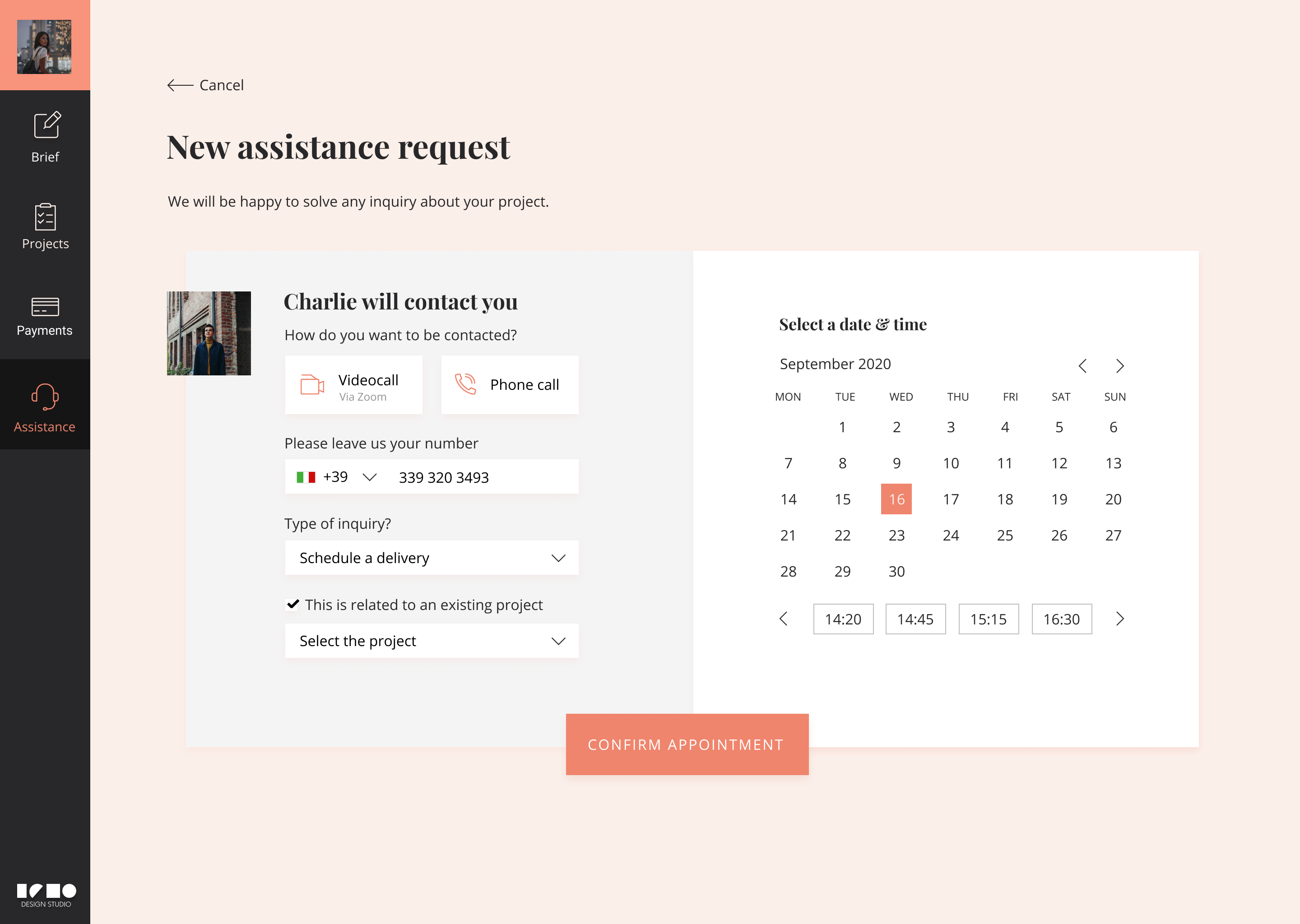
Assistance request
In any time of the process the client can request a video or phone call assistance in order to solve specific questions or supply detailed information.
Visual design
The selection of the typography, the color palette and the iconography was based on the desire of the company to portray the platform as stylish, clean and contemporary. For instance, using a serif font for the headings and a sans-serif font for the text blocks was a design decision that reinforce the general look and feel of the application towards the desired direction. In terms of color, the contrast generated between pastel tones and bright salmon was used to highlight elements inside the interfaces.


To maintain visual coherency with the rest of the visual elements, a set of outline icons with lean stoke was selected to be used accross the application and the website. The stylized appearance of these elements was relevant for the look of different components by enhancing the content and supporting the story telling attributes of the interfaces.

Strategy
Getting users from the website
As part of the marketing strategy to generate leads on new users for the platform a one page website was designed to support the funnel conversion. The structure was thought to be simple and concrete, highlighting the added values of the app and its most relevant features.
Lessons learnt
- There's no fixed design framework.Projects in real life are constantly changing, and it's important to always assume those changes with a problem-solving approach.
- Find a common language with your team. Sometimes is a moodboard, other a wireframe or even just a conversation. Try to be as assertive as possible when communicating your design decisions.
- Go the extra mile. It's impossible to have all the answers, but when you don't just help your team to find the right one.
🙌 Special thanks to: Rayana Hossain(Dekko Gruop CEO) and Rajib Chowdhury(Dev Team).